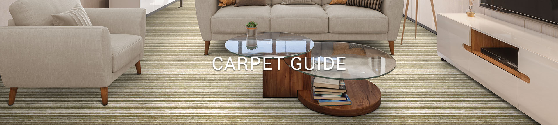
Designing With Carpet
Today we have a wonderfully wide choice in everything, especially home furnishings. Who would have it any other way? But a great range of carpet styles, designs and colors available on the market today can be a mixed blessing. While the selection is better than ever, deciding on an overall “look” is increasingly difficult.
Determining “which carpet” isn’t a decision to be made in isolation. The most successful home interiors are designed with continuity in mind. Even while certain rooms may take on an individual character, it’s useful to think of your home as a whole rather than a series of unrelated spaces.
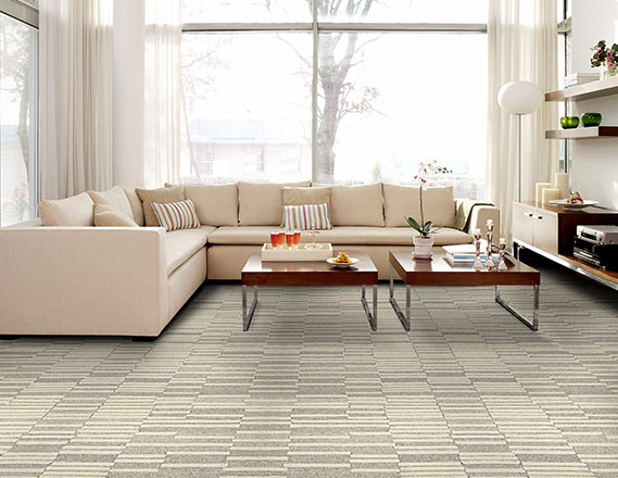
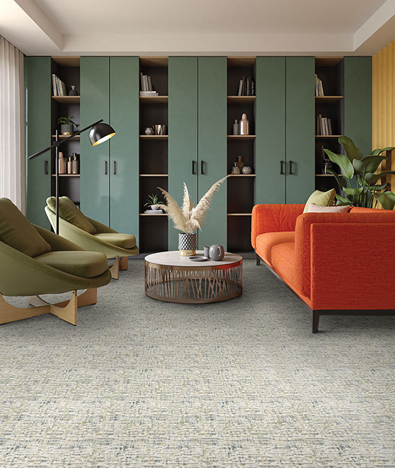
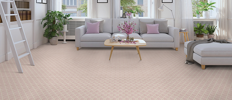
Your choice of carpet can be the foundation of a decorating plan. It can be the starting point from which other ideas spring, or it can be selected to complement existing walls, furniture, fireplaces, curtains and paintings. At the very least, covering for the “fifth wall” will connect all the design elements, creating a coherent scheme for any interior.
A useful approach when planning a scheme is to think of it as an equation made up of four parts: color, pattern, texture and style. It helps to have a basic knowledge of how color, texture, pattern and style work when planning an interior.
COLOR
CREATING MOOD
Color creates mood as it manipulates size and shape and plays cleverly with light. The floor and walls are often the largest visual spaces in a room, so choosing the right color for your carpet is a very important step. Color may be the major element for your decorating scheme, or deliberately subordinate. Either way, understating the color wheel and the special effects of color is a fail-safe.
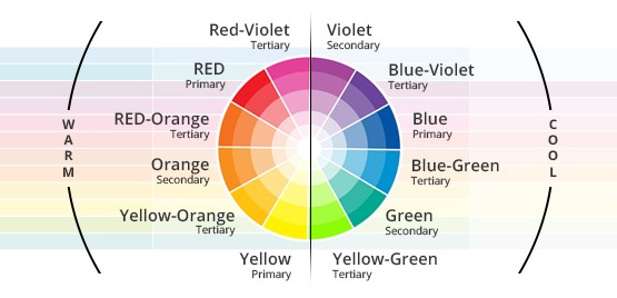
THE COLOR WHEEL
The color wheel is made up of primary colors, secondary colors and shades or tones. Primary colors are RED, BLUE and YELLOW. They are pure. Combining primary colors provides secondary colors. Primary and secondary colors are situated around the edge of the wheel. Every primary and secondary color comes in a variety of shades or tones. These are found around the inner circles of the wheel. The color wheel defines cool and warm colors. Colors on the blue and green side are cool, while red and orange are warm.
COMBINING COLOR
There are three ways you can combine color to create a scheme and mood for your home.
- Mix different tones of one color.
- Use colors that are found close to one another on the wheel.
- Use colors from opposite segments of the wheel.
The Special Effects of Color
CREATE SPACE
Make a small room seem spacious by using soft cool colors. Like faint hills in the distance, soft colors give the impression of being further away, and therefore don’t absorb space. Strong colors make objects appear closer and therefore help make a large open room seem more cozy and intimate.
HIDE IT
Awkward elements in a room can be camouflaged with clever use of color. A large Victorian sofa, upholstered in a dusky blue, will seem less bulky and merge into a room scheme when the carpet and walls are in a closely matched shade.
TURN UP THE HEAT
Warm colored carpet or warm colored accessories like curtains or cushions take the chill off a room and create an abundance of energy.
TAKE IT HIGHER
Mixing colors can provide a feeling of height. Use the darkest shade on the floor, the next shade on the walls, and the lightest shade on the ceiling.
ORGANIZE IT
Carpet and walls are the two largest visual areas in any room. For a sense of unity and organization, color them in related shades.
CALM IT
Neutrals create a gentle, softer tranquil environment, a sanctuary for a busy working life. Pale colors are peaceful, serene and therapeutic. Eliminate visual stress and over-stimulation with simple furniture.
LIGHT IT UP
Use paler tints (colors with white added) to lighten up a dark room. The reflective quality of white bounces light around as much as possible.
BALANCE IT
Colors that appear directly opposite of each other on the color wheel such as blue and orange can be used to complement each other. This scheme will provide balance in a setting as it includes both warm and cool shades.
Color in Action

Plums and purples have a formal, almost regal, association – the result of cultural influences rather than their use in nature. While strong purples deliver impact and drama, paler tints of mauve and lavender can be subtle and delicate.

The color of sunshine and spring flowers, yellow can be used to bring warmth and lightness to the home. It reflects light, and can be used to brighten a dingy room.

Tones of orange, tan and golden brown are warm, cozy colors. Brighter accents can liven a basic color scheme of neutral browns.

Green, nature’s own color, encourages introspection and calm – a mood one might seek for a living room or bedrooms.

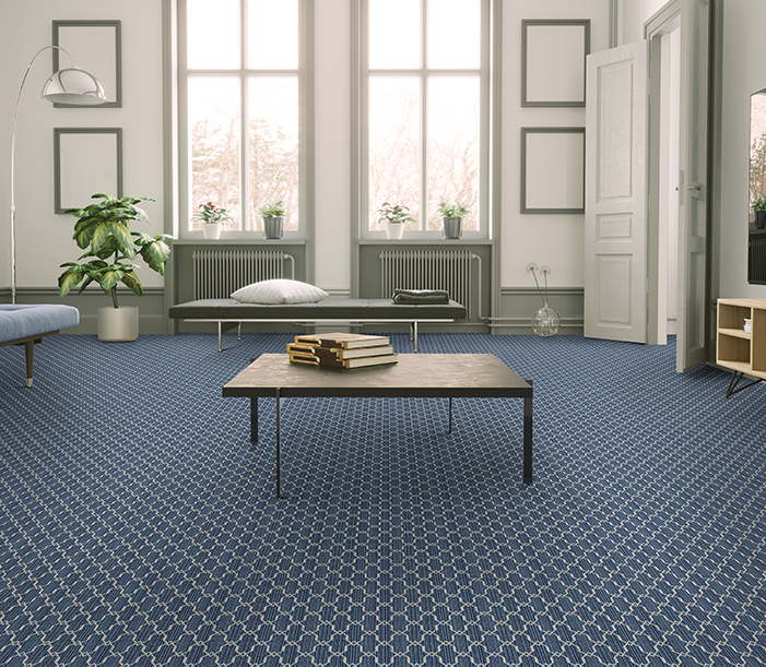
Blue, the color of water and sky, can be used to create a cool, spacious environment. Tranquil blues have a calming effect in rooms like bedrooms and studies. Blue is an ideal color for rooms with plenty of sun.
Neutrals such as grey, beige and pale browns are restful, creating a quiet, warm atmosphere. A palette of neutral shades can be used to offset the other features of a room, such as brightly colored area rugs, paintings or furnishings.

Red, the color of fire, is rich, warm and lively. It has a welcoming quality, but can be over-stimulating if used for large areas in frequently used rooms. Because red stimulates the appetite, it is a traditional choice for dining rooms. For less intensity choose pink as it also suggests warmth.
Quick Tip
Only by studying color in your own home can you really be sure it is for you. The color of other furnishings in the room, as well as the amount of natural light, will affect the way your carpet looks. Artificial light tends to “grey” colors, so check your samples both in daylight and under night lighting. Remember that a whole floor of carpet won’t look exactly the same as a small sample. Looking at the biggest possible carpet sample on the floor for which it’s intended is the best way to see how it will look after the carpet is installed. Keep a piece of the carpet. It will be invaluable when shopping for additional items, or when altering the
scheme in later years.
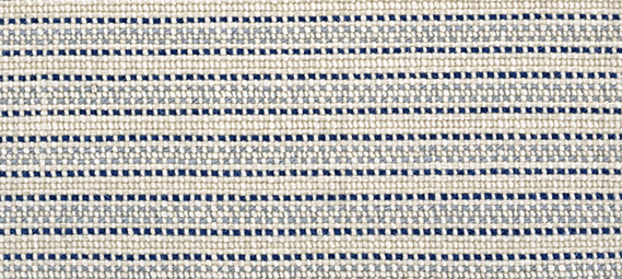
Special Effects of Pattern
Shrink It
Large areas of pattern will close in a room, particularly if the pattern’s repeat is large.
Hide It
Patterned carpet disguises soiling and natural wear and tear – thus it is popular with restaurants and hotels.
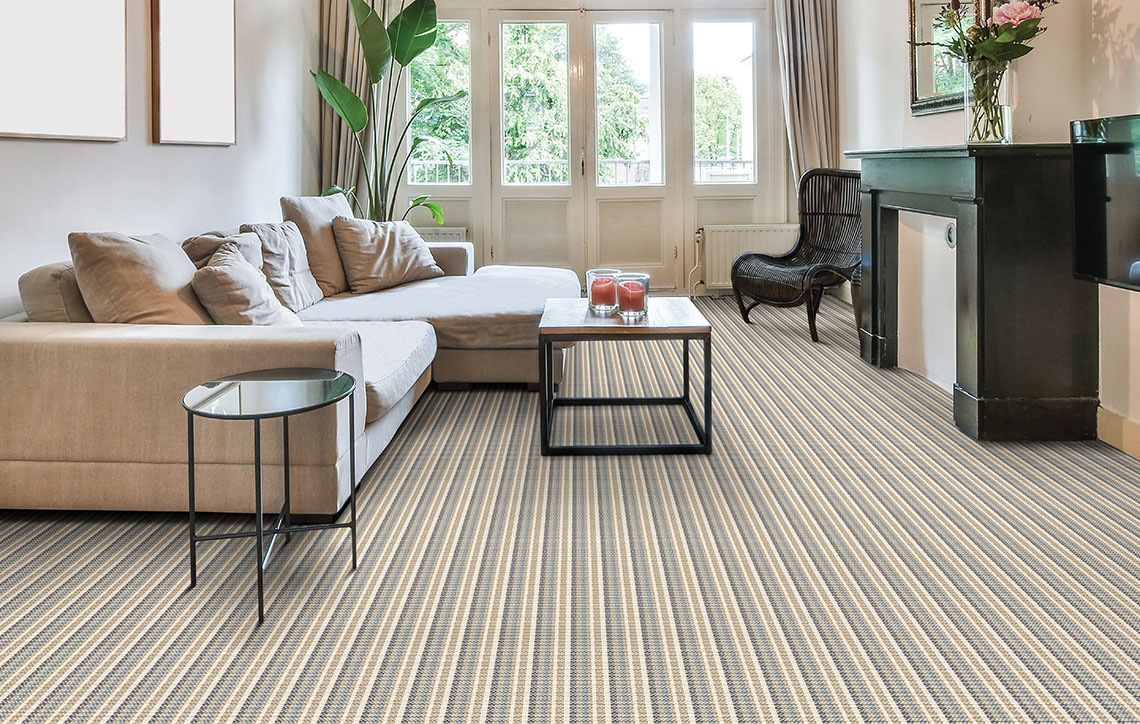
Stretch It
Stripes can stretch the dimensions of a room by drawing the eye in the directions of the stripe.
Define It
Pattern can also suggest different areas. Area rugs, for example, can indicate a dining area or a conversation corner.
Avoid Pattern Overdose
Patterns can be done very well or very badly! Some rooms suffer from “pattern overdose” as many themes strive for dominance. The problem can be compounded when less obvious patterns – brickwork, windows, or a pattern that can be seen in an adjoining room-are overlooked.
The general rule of thumb: If the patterns are related by style, color or texture, the mix is more likely to succeed. Its safer to restrict yourself to one furnishing pattern per room.
Quick Tip
Try patterns in position at home before buying. The larger the sample the better. The proportions of a pattern can look quite different in the context of your room. Make sure the pattern complements the style of your furniture.
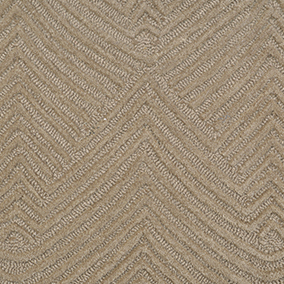
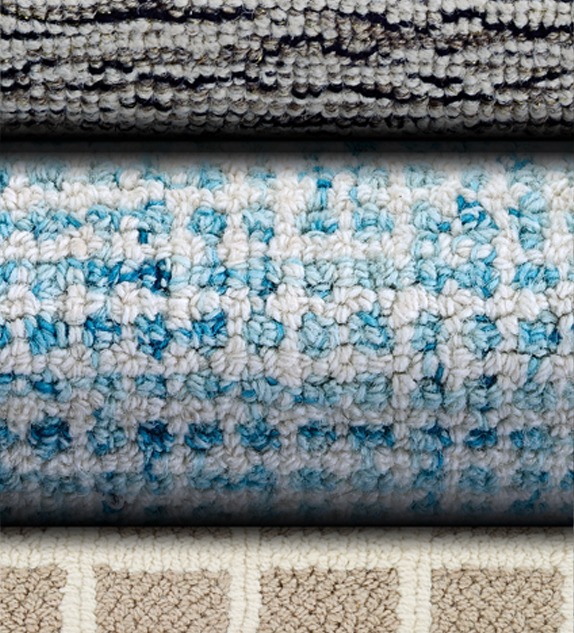
The Special Effects of Texture
TURN UP THE HEAT
A stippled cut-pile or chunky wool sisal carpet, with rustic tweed upholstery and a lovely rich wall color will help warm a room that doesn’t receive much sun.
CREATE SPACE
To achieve a sense of spaciousness without sacrificing textural interest, a pale, closely-textured wool sisal carpet in soft grey-green or blue would suggest the faded colors we associate with distance.
DARKEN IT
Rougher textures absorb more light than smooth surfaces. The same color yarn in a high and low pile construction will give a darker-looking carpet than if used in a uniform pile carpet.
Internationally, texture is the hottest story in interior design and nothing has captured this direction more than carpet. Wool carpets provide an extraordinary array of textural delights, making the floor an enticing living space.
But what is texture? Texture is all about how it feels when we touch it. It isn’t just uneven surfaces, such as nubby woolen tweeds or roughcast plaster surfaces. Everything in a home makes a textural contribution rough, smooth, shiny, glossy and silky and so on…
Response to a particular material is related to its touch. A room decorated with chrome furniture, glossy painted walls and slate flooring might be described as “hard-edged and cold”. This impression would be based on the touch associated with the materials used. Warm, cozy, soft textures such as wool are linked with the comfort of home.